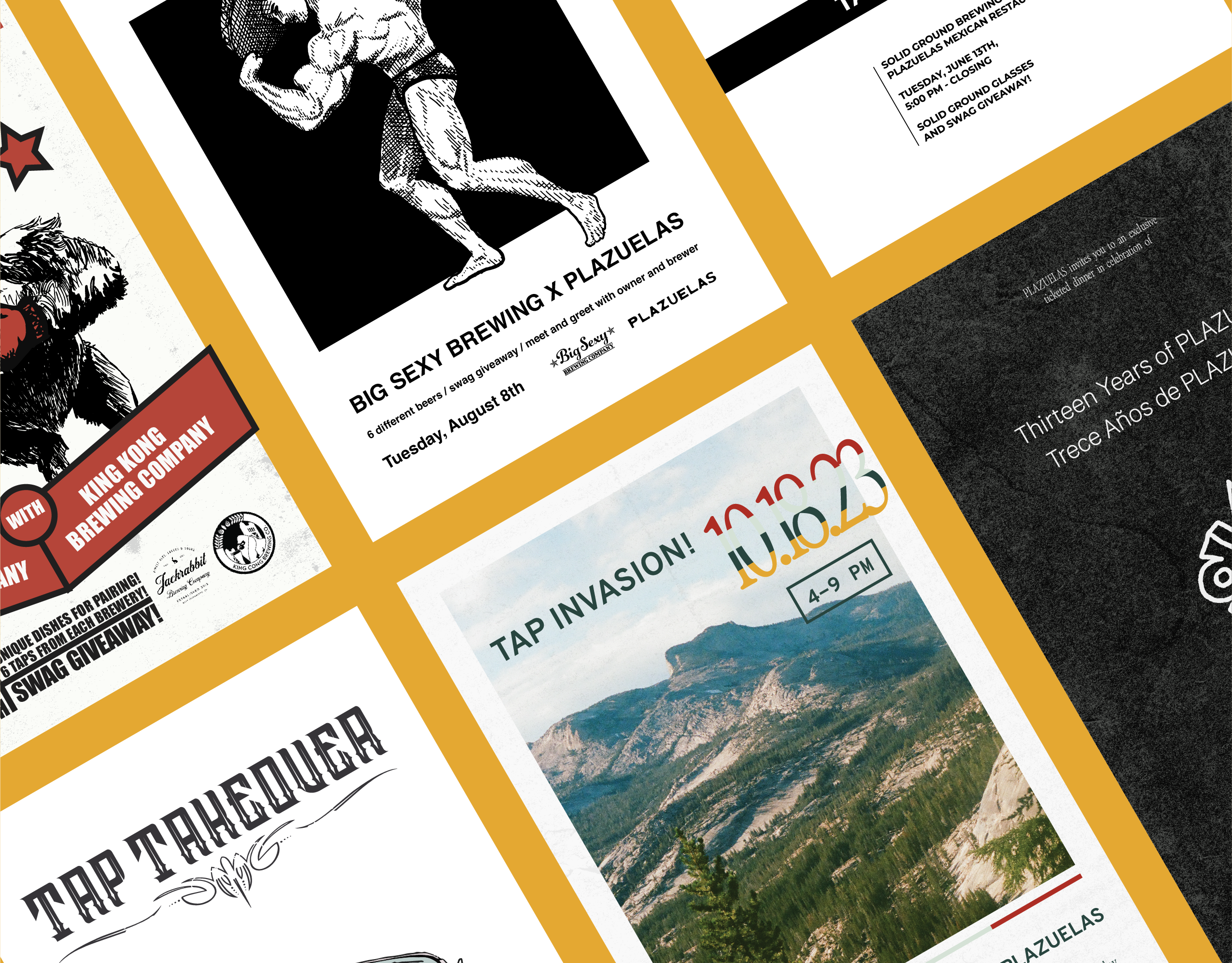

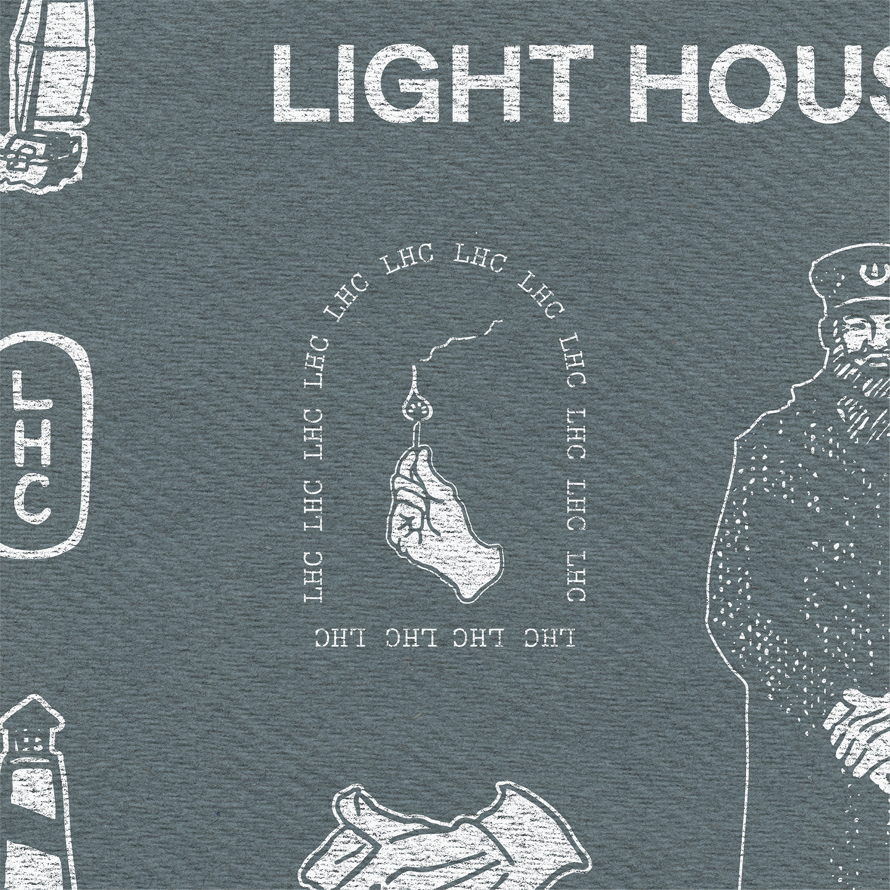
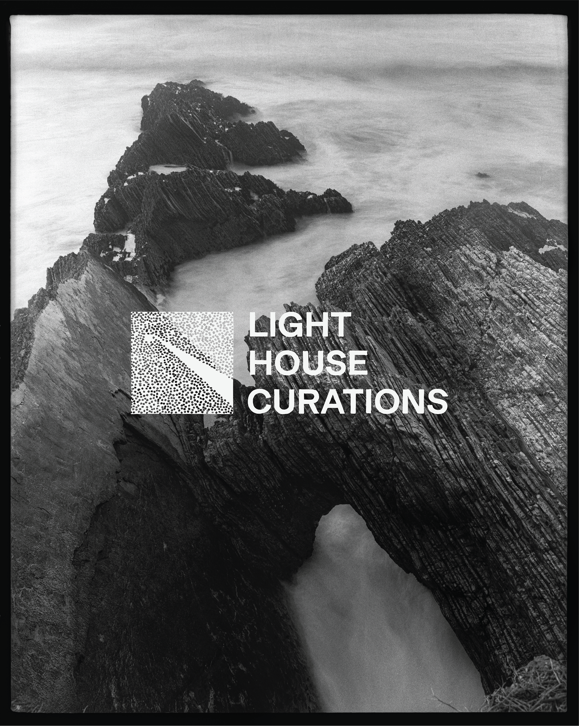
Light House Curations, the brainchild of Matt Hume and Charlie Hoberman, is a print and art rental service that curates aesthetically consistent collections of work for rent while partnering with an all-star group of photographers to print, frame, and connect their work to a discerning audience.
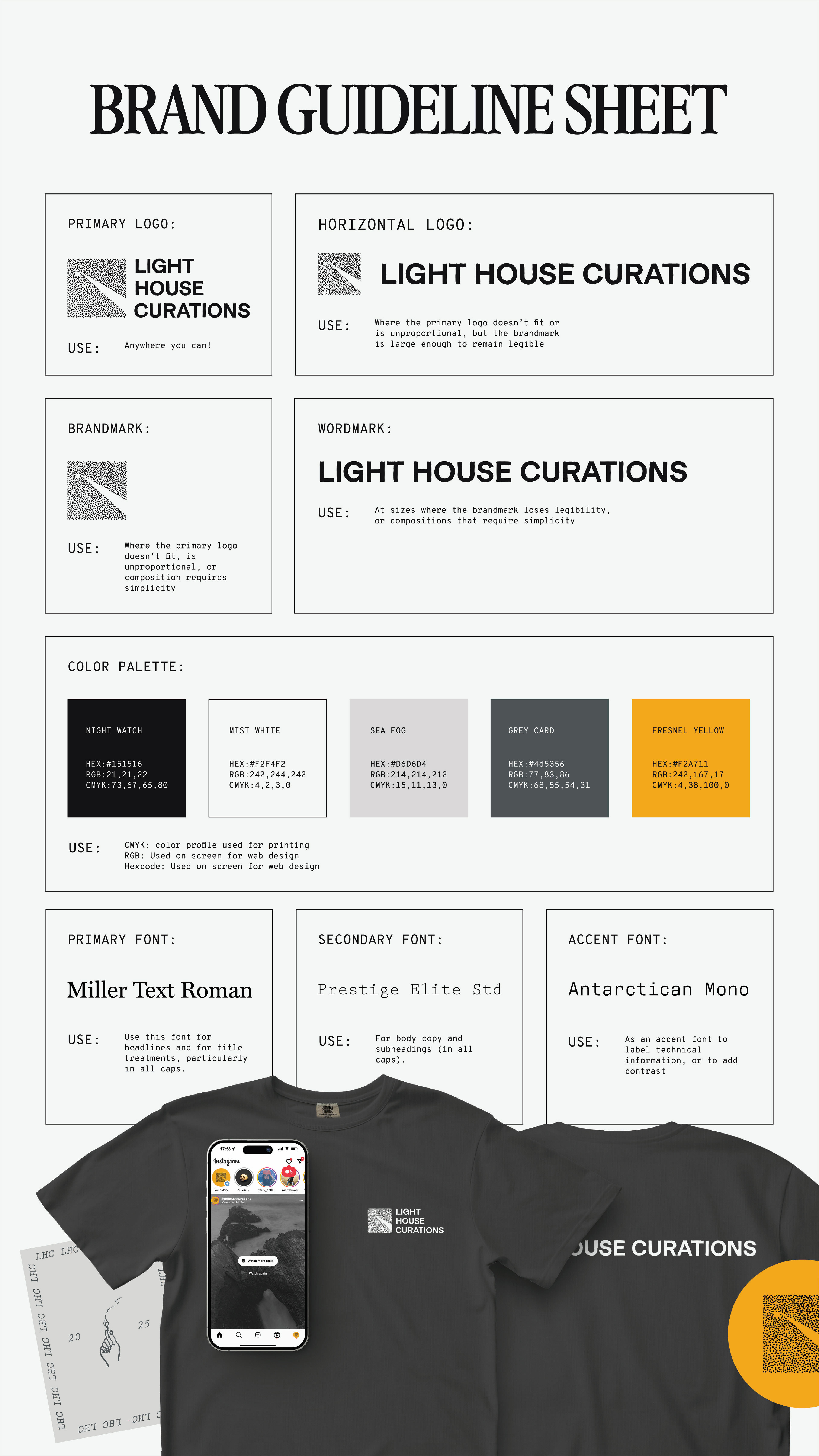
Matt and Charlie approached me for help in creating the business's brand identity. They needed a brand that would communicate their value for handcrafted, analog artwork, while appearing polished and premium. I provided them with a hand-drawn wordmark inspired by post-war nautical typography and a hand-stippled brandmark evocative of film grain and a the view of a lighthouse's signal adrift at sea. The logo system was complemented by a full suite of brand illustrations, a color and typography system, and a mascot, and integrated within a brand guideline document to guide future creation.
SCOPE:
-Logo System
-Typography & Color
-Illustration System
-Illustrated Mascot
-Brand Guidelines
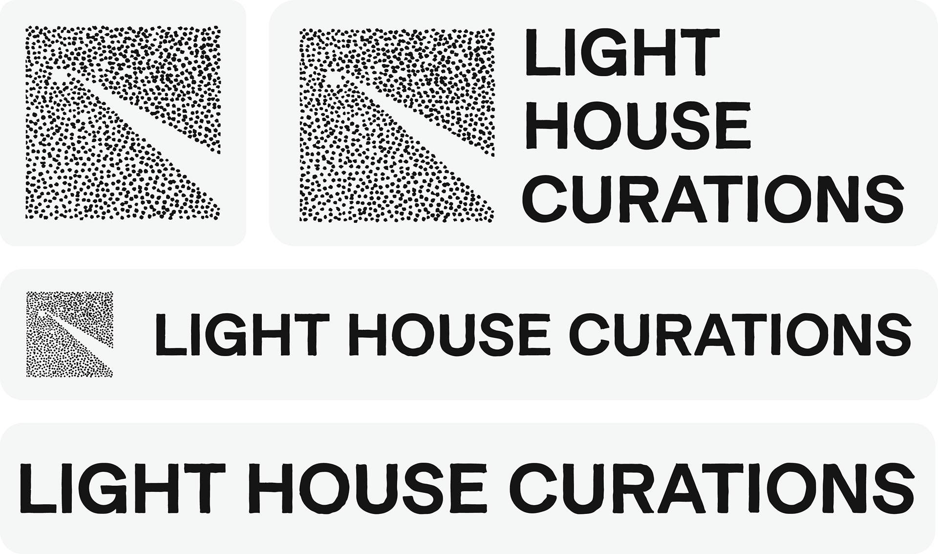
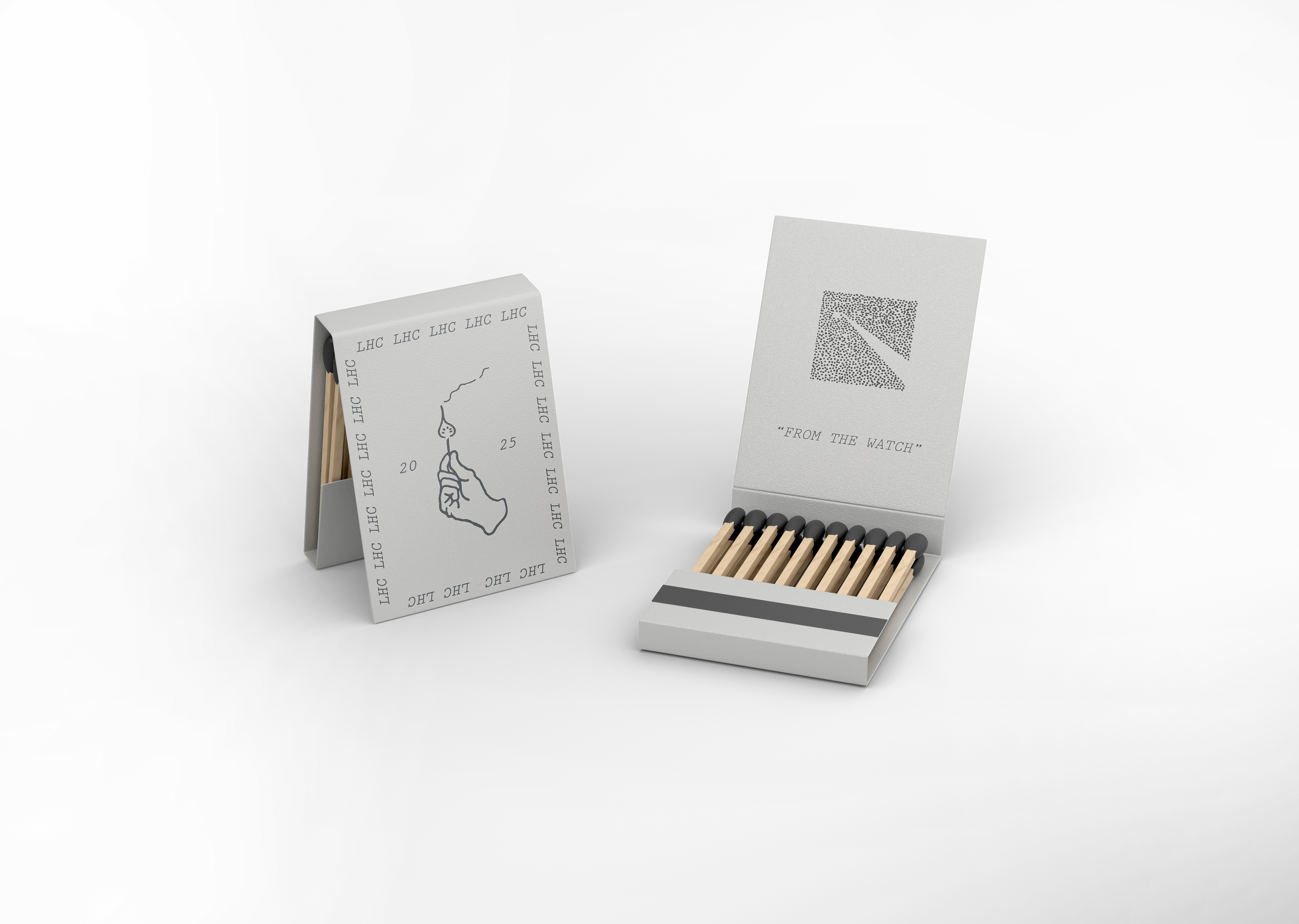
LOGO SYSTEM
Simple and impactful, the LHC logo carries the brand to the variety of aesthetics and approaches LHC's photographers contribute.
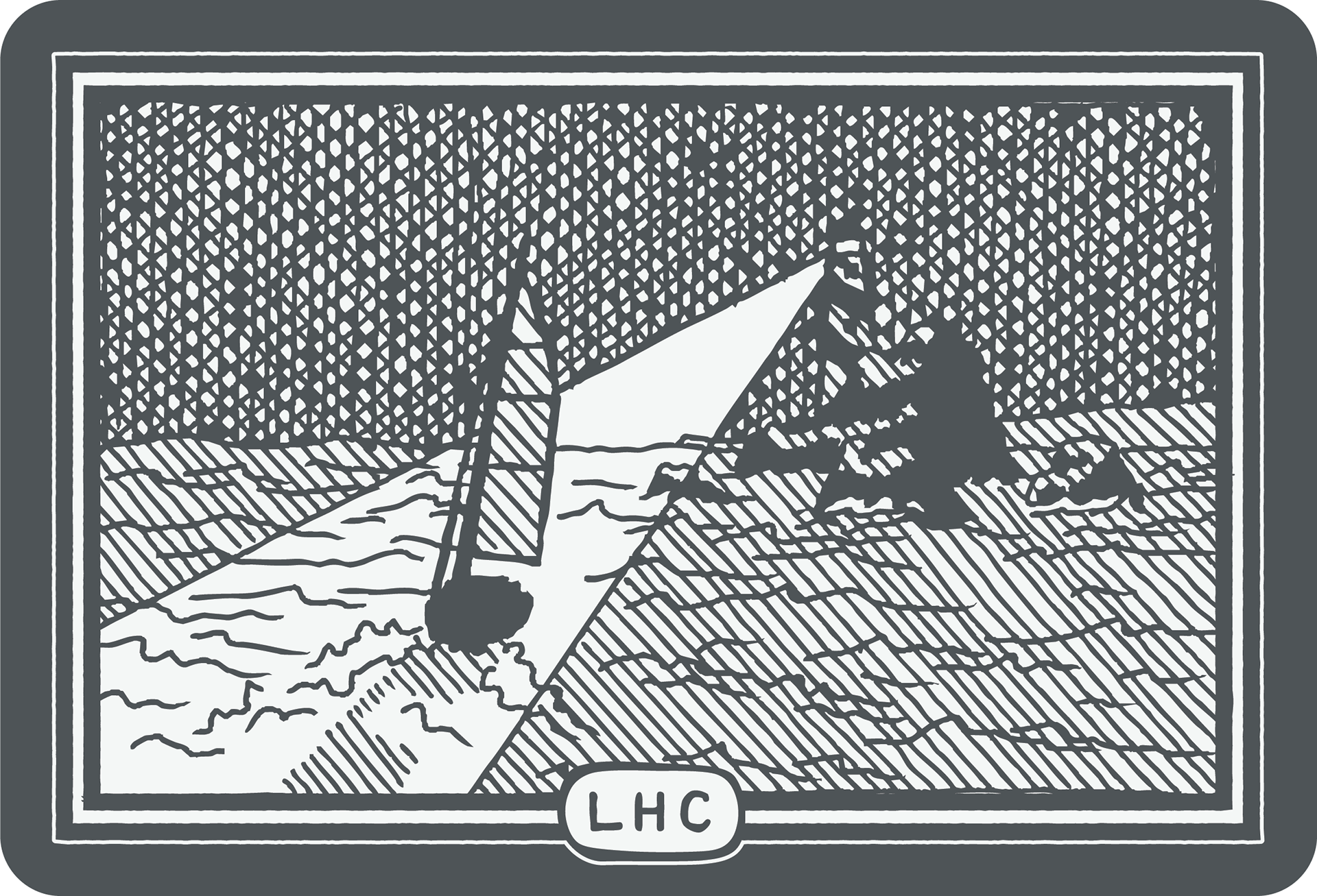
Brand Illustrations

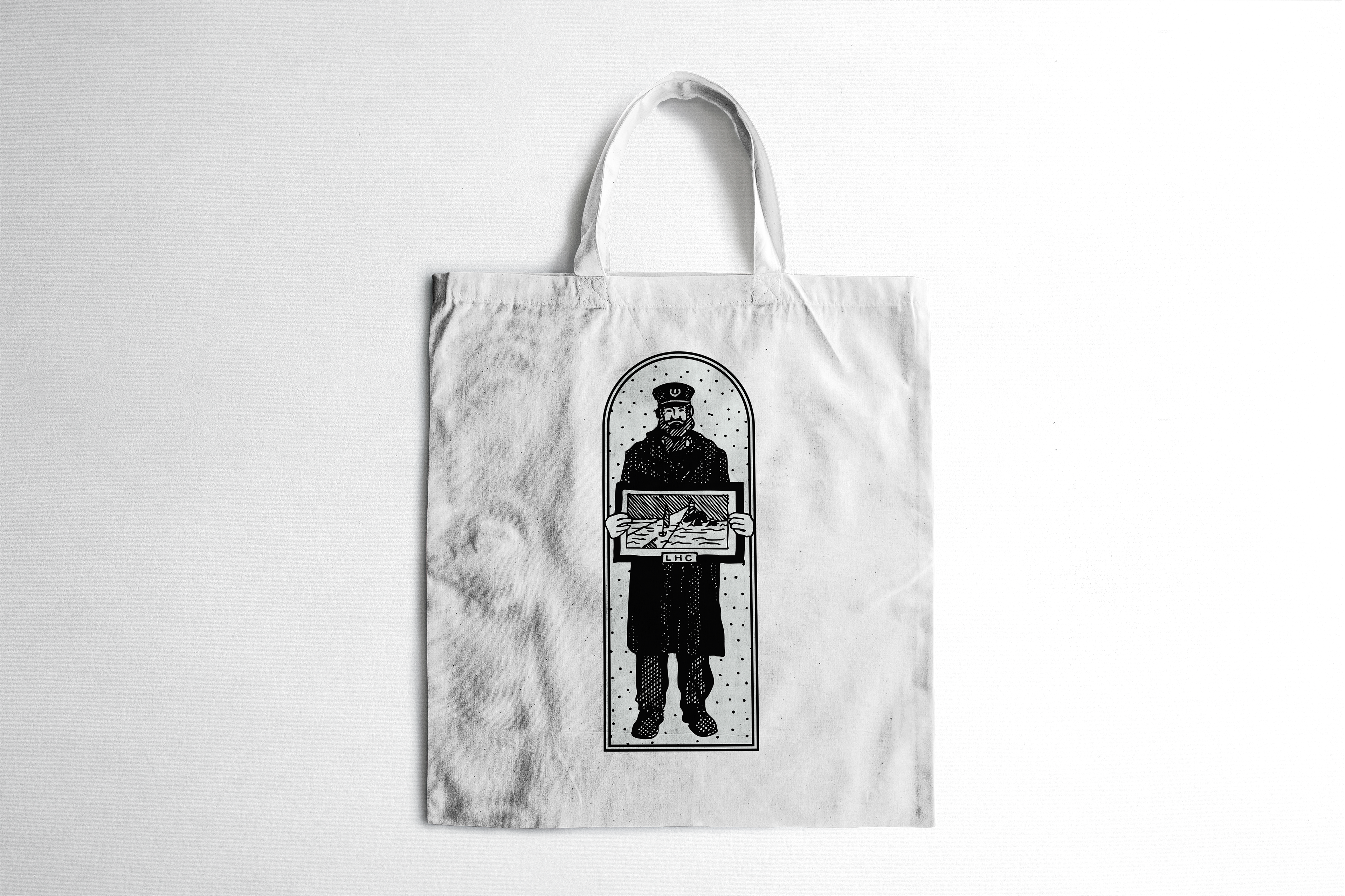
Mascot System
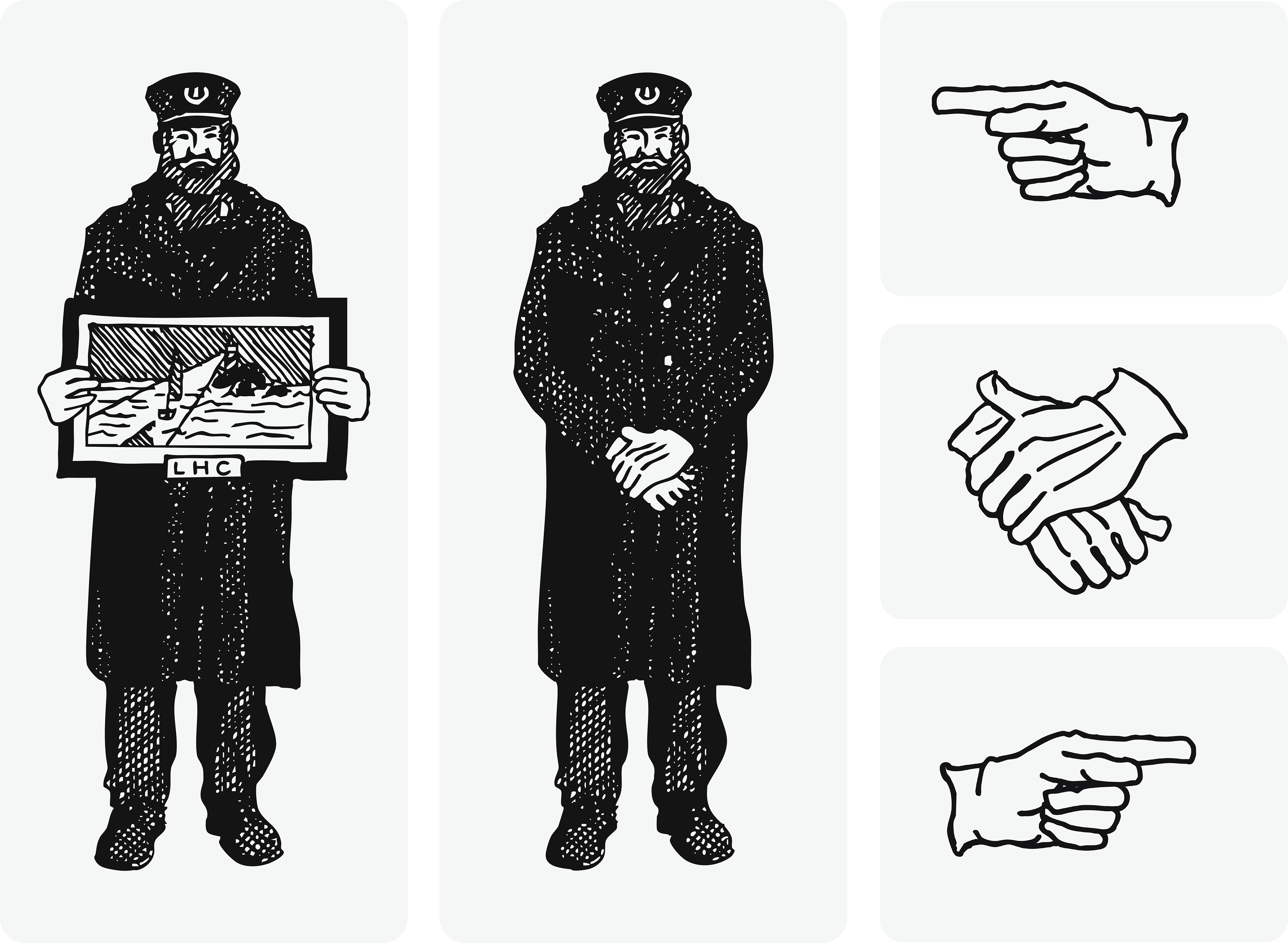
The Keeper is LHC's mascot. Careful and considerate, he is intentionally utilized (along with his white cotton gloves) to add a touch of character and approachability to LHC's branding.
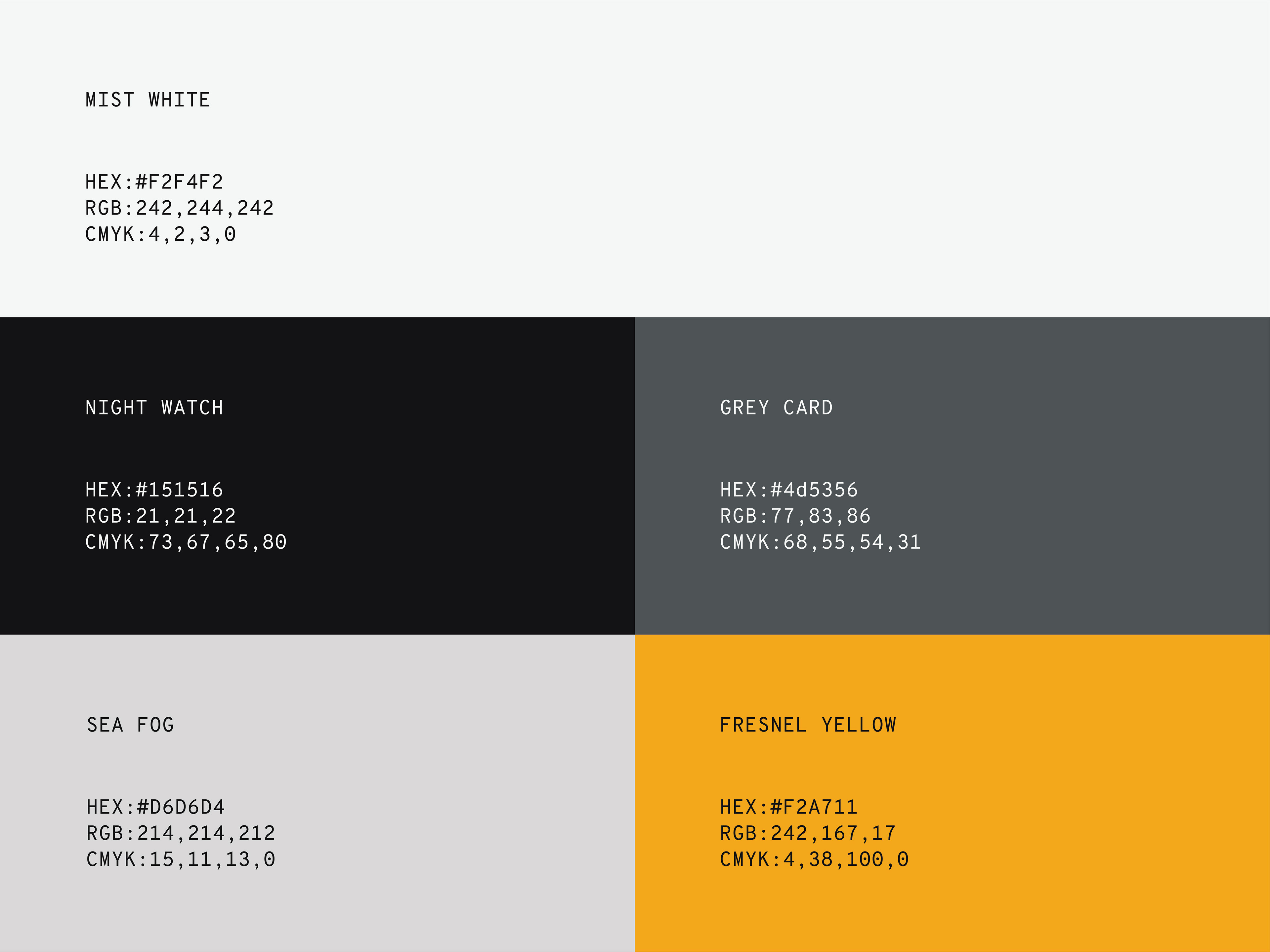
Color Palette
Lorem ipsum dolor sit amet, consectetur adipiscing elit. Cras ullamcorper magna nibh, non pretium dui faucibus vel. Mauris sed mauris blandit mi consectetur mattis. Donec eu venenatis sem. Phasellus tellus urna, varius ut rhoncus sit amet, viverra ac neque. Quisque quis congue velit. Class aptent taciti sociosqu ad litora torquent per conubia nostra, per inceptos himenaeos. Nunc id purus placerat, lacinia ex vitae, efficitur magna. Integer in quam elit. Suspendisse lacinia convallis neque ut pellentesque. Phasellus odio eros, venenatis at mi ac, volutpat congue purus. Maecenas venenatis et lorem quis convallis. Maecenas bibendum purus in felis vehicula vulputate.
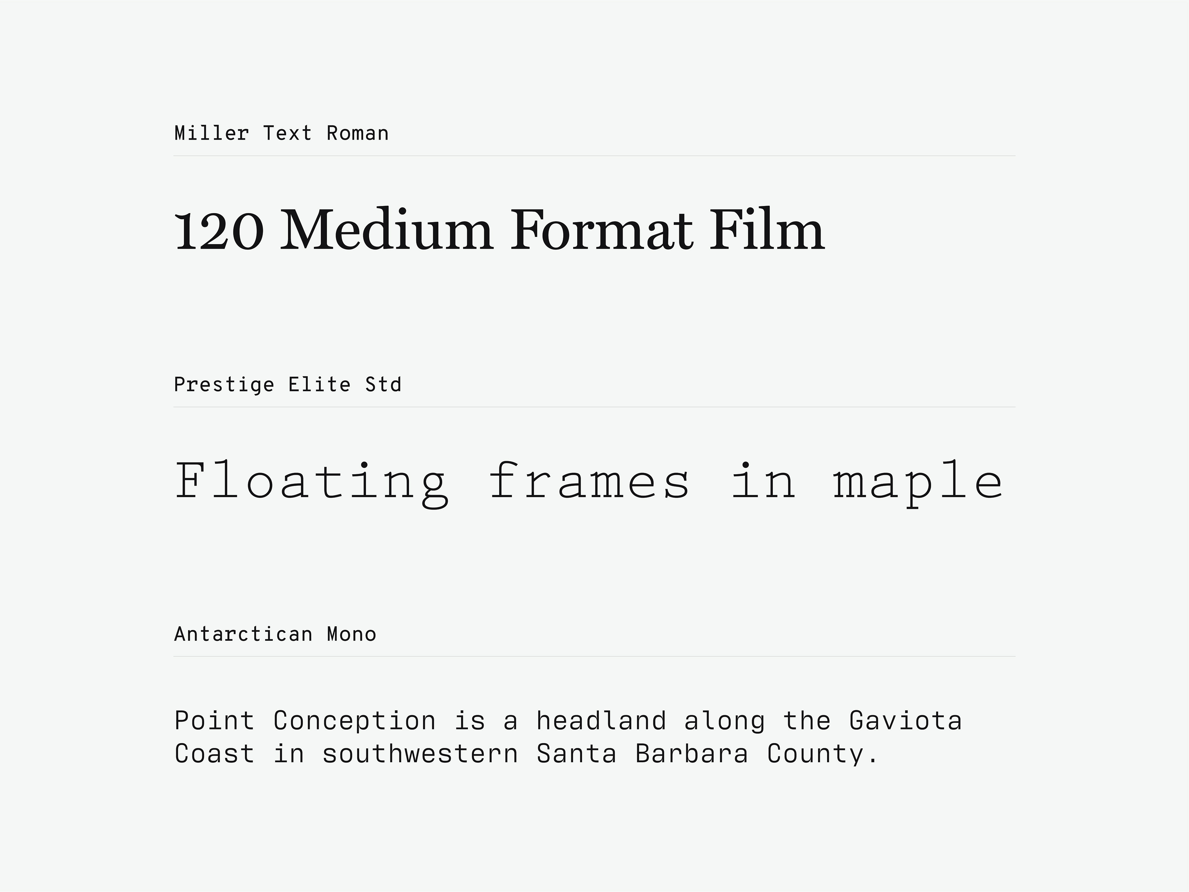
Typography
Lorem ipsum dolor sit amet, consectetur adipiscing elit. Cras ullamcorper magna nibh, non pretium dui faucibus vel. Mauris sed mauris blandit mi consectetur mattis. Donec eu venenatis sem. Phasellus tellus urna, varius ut rhoncus sit amet, viverra ac neque. Quisque quis congue velit. Class aptent taciti sociosqu ad litora torquent per conubia nostra, per inceptos himenaeos. Nunc id purus placerat, lacinia ex vitae, efficitur magna. Integer in quam elit. Suspendisse lacinia convallis neque ut pellentesque. Phasellus odio eros, venenatis at mi ac, volutpat congue purus. Maecenas venenatis et lorem quis convallis. Maecenas bibendum purus in felis vehicula vulputate.
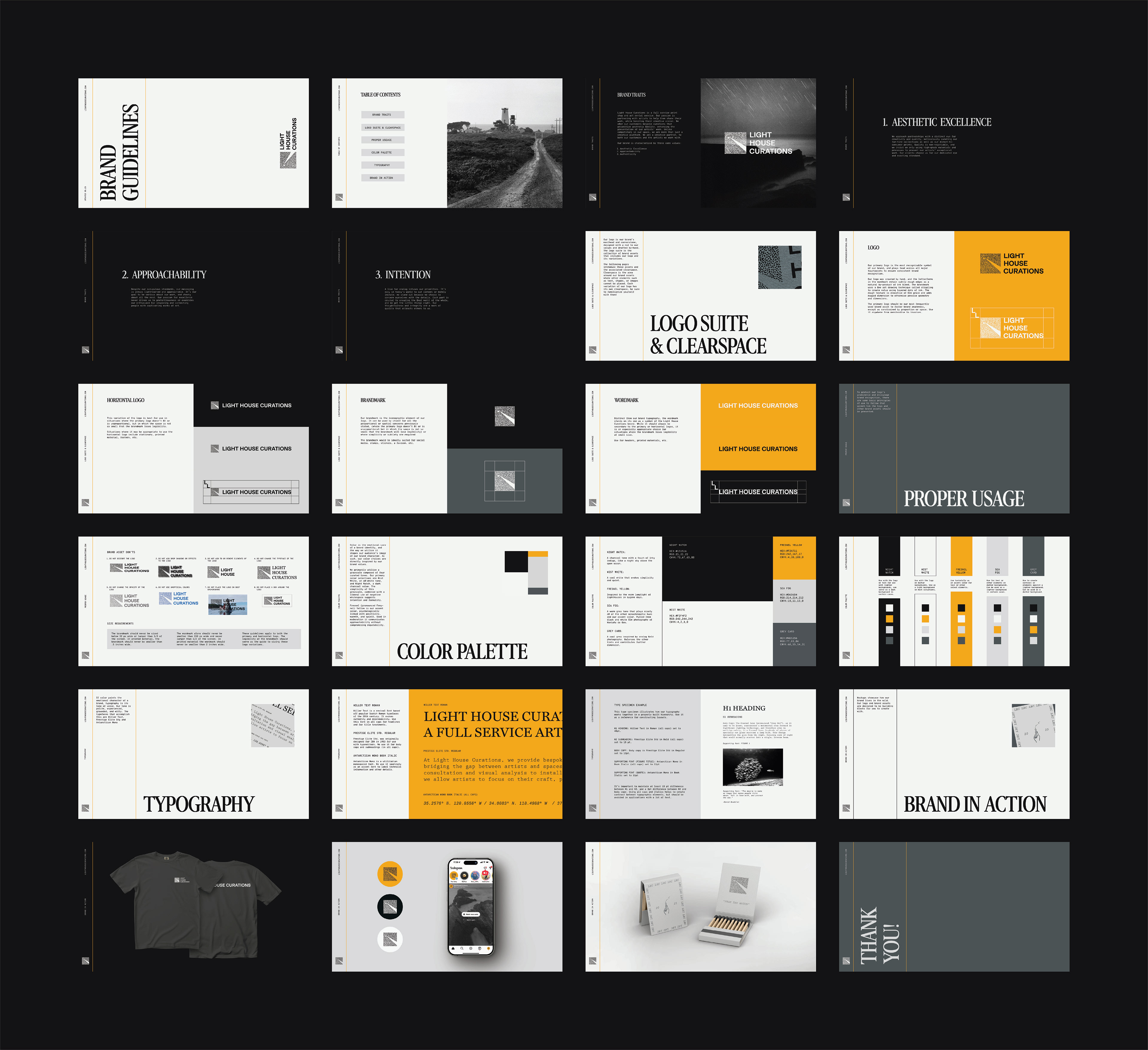
Brand Guidelines
Lorem ipsum dolor sit amet, consectetur adipiscing elit. Cras ullamcorper magna nibh, non pretium dui faucibus vel. Mauris sed mauris blandit mi consectetur mattis. Donec eu venenatis sem. Phasellus tellus urna, varius ut rhoncus sit amet, viverra ac neque. Quisque quis congue velit. Class aptent taciti sociosqu ad litora torquent per conubia nostra, per inceptos himenaeos. Nunc id purus placerat, lacinia ex vitae, efficitur magna. Integer in quam elit. Suspendisse lacinia convallis neque ut pellentesque. Phasellus odio eros, venenatis at mi ac, volutpat congue purus. Maecenas venenatis et lorem quis convallis. Maecenas bibendum purus in felis vehicula vulputate.
Lorem ipsum dolor sit amet, consectetur adipiscing elit.