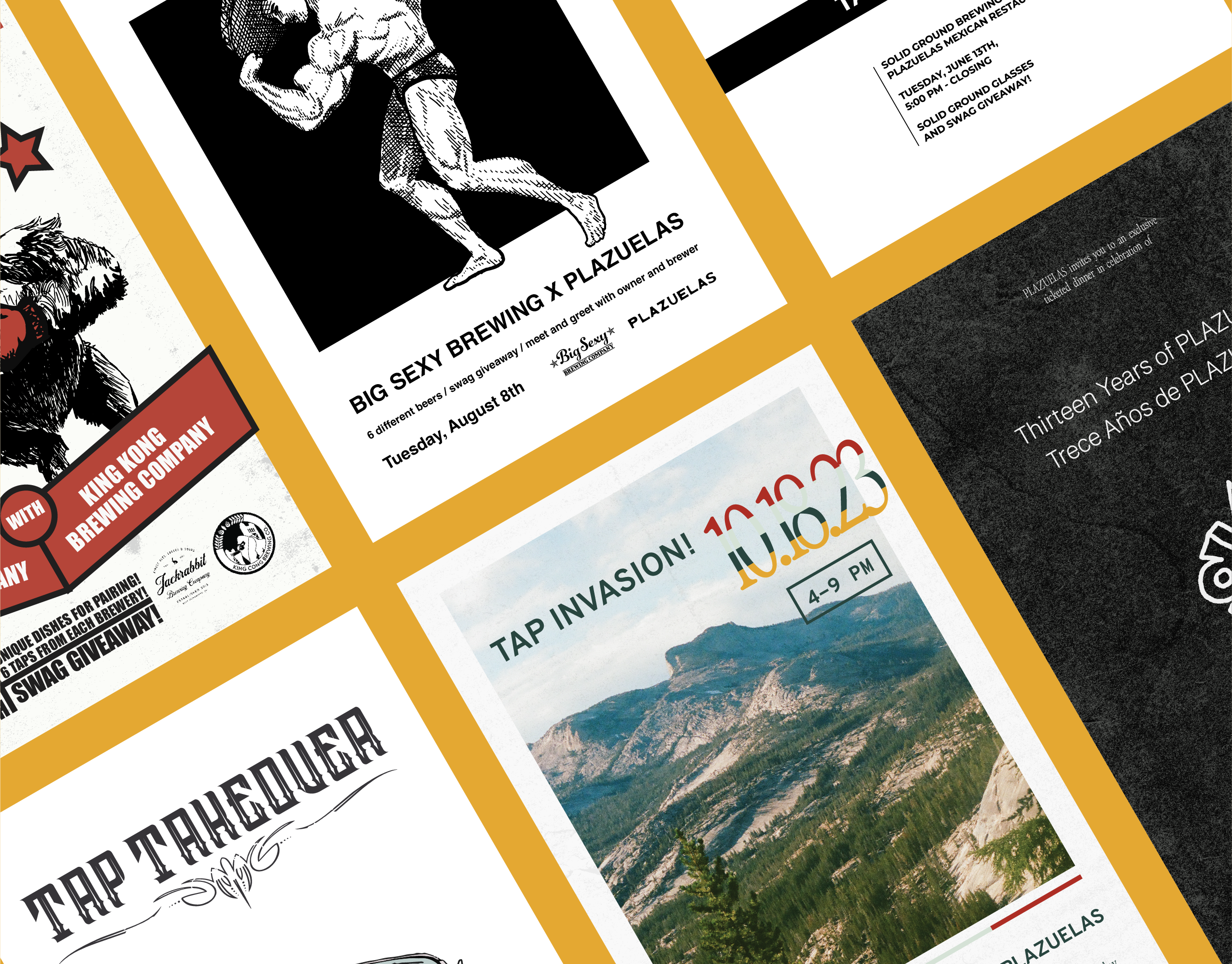
I was a fan of Plazuelas long before we worked together. The restaurant is constantly improving, morphing over the years from a tiny taqueria into its current iteration as a Mexican bistro complete with top-shelf cocktail bar specializing in traditional Mexican spirits.
This constant reinvention has meant the owners are hesitant to nail down a fully articulated brand identity. So, the challenge in our ongoing collaboration has been to develop a visual language that is recognizably Plazuelas without a defined brand system. The design we’ve created together over time captures the essence of Plazuelas even as it is continually evolving; maintaining tension between defined and undefined, elevated and casual, innovative and traditional.
This constant reinvention has meant the owners are hesitant to nail down a fully articulated brand identity. So, the challenge in our ongoing collaboration has been to develop a visual language that is recognizably Plazuelas without a defined brand system. The design we’ve created together over time captures the essence of Plazuelas even as it is continually evolving; maintaining tension between defined and undefined, elevated and casual, innovative and traditional.
SCOPE:
-Typography & Color
-Illustrations
-T-shirts
-Sweatshirt
-Hat Patches
-Gift Card
-Social Media Profile
The Framework
There are three basic ideas that underlie the projects I’ve worked on with Plazuelas: the Agave plant (and its growth and harvest,) the Plazuelas wordmark (set in the typeface Oaxcaca,) and arches (a distinctive feature of Mexican architecture.)
T-Shirts
Sweatshirt
Hat Patches
Gift Card
Social Media Profile
